Klopers: A Friendly Display Font for Joyful Digital Experiences
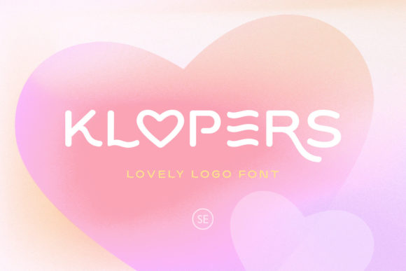
Klopers is a display font that feels like sunshine in typographic form—light, open, and effortlessly warm. As a web and UI designer who selects typefaces for real user interfaces—not just mockups—I appreciate how Klopers balances personality with purpose. It’s not a script or handwritten font, nor a rigid geometric sans. Instead, it’s a carefully crafted display typeface with gentle curves, generous x-height, and subtle bounce in its letterforms. That “friendly” quality isn’t marketing fluff—it translates directly to how users perceive tone before reading a single word.
In digital products, first impressions are set in milliseconds—and typography is the fastest carrier of brand voice. Klopers excels where emotional resonance matters most: hero sections on landing pages, CTA buttons on SaaS sign-up flows, banner headlines in online stores, and section headers on coaching or creative portfolio sites. Its light weight and airy spacing ensure it doesn’t overwhelm, while its distinct character prevents visual fatigue—even when used at 48px on a retina display.
Readability on screen is non-negotiable, and Klopers delivers where many decorative fonts falter. Its lowercase a, e, and g are highly legible at medium sizes (32–60px), and uppercase settings hold clarity even over textured backgrounds or soft image overlays. On mobile, I recommend using Klopers exclusively for primary headings—not body text—and always pairing it with a neutral, highly legible sans serif (like Inter, Poppins, or Manrope) for paragraphs, form labels, and navigation. This pairing creates strong visual hierarchy without sacrificing scannability.
Klopers shines brightest in conversion-focused layouts. On a product launch page, a headline like “Your First Creative Workshop Starts Next Week” in Klopers—set against a clean white background with ample line height—feels inviting, not salesy. In an online boutique, banner text such as “Summer Drop Is Live” gains immediacy and warmth. The font’s inherent joy subtly lowers cognitive friction, encouraging clicks and time-on-page. That’s not magic—it’s intentional design psychology supported by smart typography.
For brand consistency across digital touchpoints, Klopers works especially well in tightly defined roles: logo lockups (when paired with a simple sans for taglines), section dividers in course dashboards, testimonial highlights on service websites, and social media graphics exported from Figma or Webflow. It’s not built for long-form reading, dense tables, or small UI elements like input placeholders—but that’s by design. A great display font knows its limits, and Klopers respects them.
When building responsive layouts, test Klopers at three breakpoints: desktop (48–72px), tablet (36–48px), and mobile (28–36px). Avoid scaling below 24px—even bold variants lose charm and legibility there. On dark mode interfaces, use a slightly lighter weight or increase letter-spacing by 2–4% to maintain airiness. For image overlays, apply a subtle semi-transparent background behind the text or use a soft text shadow (text-shadow: 0 1px 2px rgba(0,0,0,0.1)) to preserve contrast without harshness.
Font pairing is where Klopers reveals its versatility. With a neutral sans serif—especially one with low contrast and open apertures—you get balance: personality up top, clarity below. Try Klopers + Inter for SaaS dashboards, Klopers + Lato for editorial blogs, or Klopers + Montserrat for modern e-commerce banners. If your brand leans more refined or literary, pair it with a crisp, low-contrast serif like Crimson Text or Literata—but keep serif usage limited to subheaders or pull quotes, never body copy.
Before integrating Klopers into production, verify file support: it ships as WOFF2 (ideal for web), includes standard Latin character sets, and offers OpenType features like ligatures and stylistic alternates. While it doesn’t yet support extended Cyrillic or Arabic scripts, its coverage is solid for English, Spanish, French, German, and Dutch—covering most global-facing digital products. Always serve it via a self-hosted font stack (not Google Fonts) to ensure licensing compliance and loading control.
Licensing is practical, not punitive. Klopers is a commercial font, meaning you’ll need a web license for any live site—even personal portfolios or client landing pages. Most licenses cover unlimited pageviews, multiple domains under one brand, and use in templates you sell (e.g., Webflow or Figma kits), but always confirm usage rights for embedded apps or white-labeled SaaS tools. Never assume free-for-personal-use applies to client work or revenue-generating sites.
I’ve used Klopers across contexts where tone directly impacts engagement: a mindfulness app’s onboarding flow (replacing sterile system fonts with something softly human), a children’s learning platform’s module titles (adding playfulness without sacrificing clarity), and a boutique skincare brand’s email headers (conveying care and craft in two words). Each time, the result was sharper brand recognition and higher interaction rates—not because Klopers “sells more,” but because it helps users feel welcomed, understood, and visually aligned with the experience.
Typography in digital design isn’t about decoration. It’s about rhythm, trust, and silent conversation. Klopers contributes meaningfully to all three—not by shouting, but by smiling. When your goal is to make users pause, connect, and stay awhile, a display font like Klopers becomes less of an aesthetic choice and more of a functional one.